parallax background

AdviserOnline uplift


AdviserOnline is the secured site for all the financial advisers affiliated with MLC. The platform required a major system update, as well as UX and UI uplift.

As a senior consultant, I joined two other designers looking after this project. We were embedded in an agile scrum team working in 2-week sprints, 6-sprint cycles.

The projected presented various challenges, including:

  • a limited budget for a complete UX review and IA restructure, which meant we had limited control over the existing content structure and amount, over 1200 pages,
  • a high volume of stakeholders which created additional challenges with existing processes and approvals,
  • several systems still relying on old infostructure, which created significant technical challenges.


Approach

Following the 2-week sprints structure, we conducted various activities, including workshops with stakeholders, one-on-one interviews, and ongoing guerilla user testing sessions.

We followed an "Align -> Define -> Design -> Deliver" process.

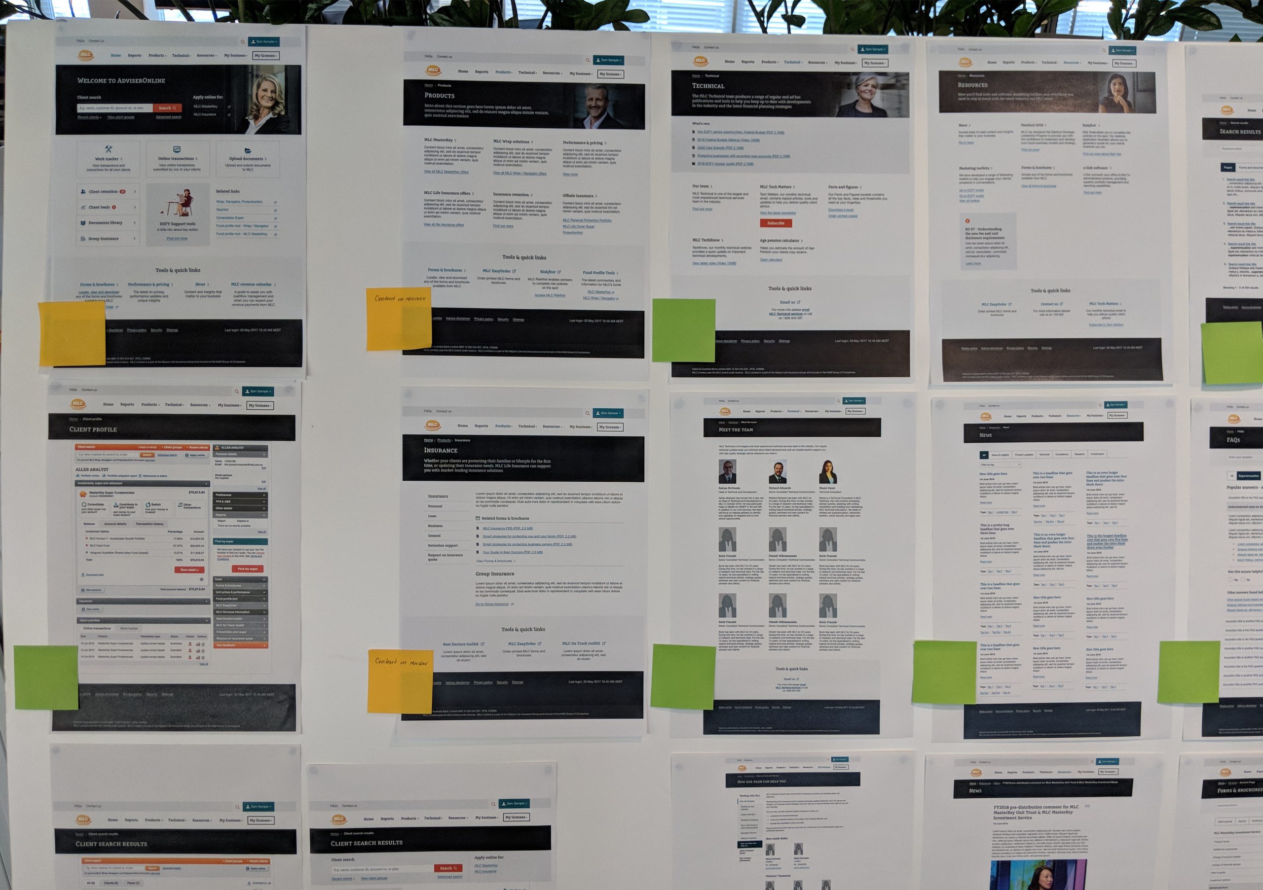
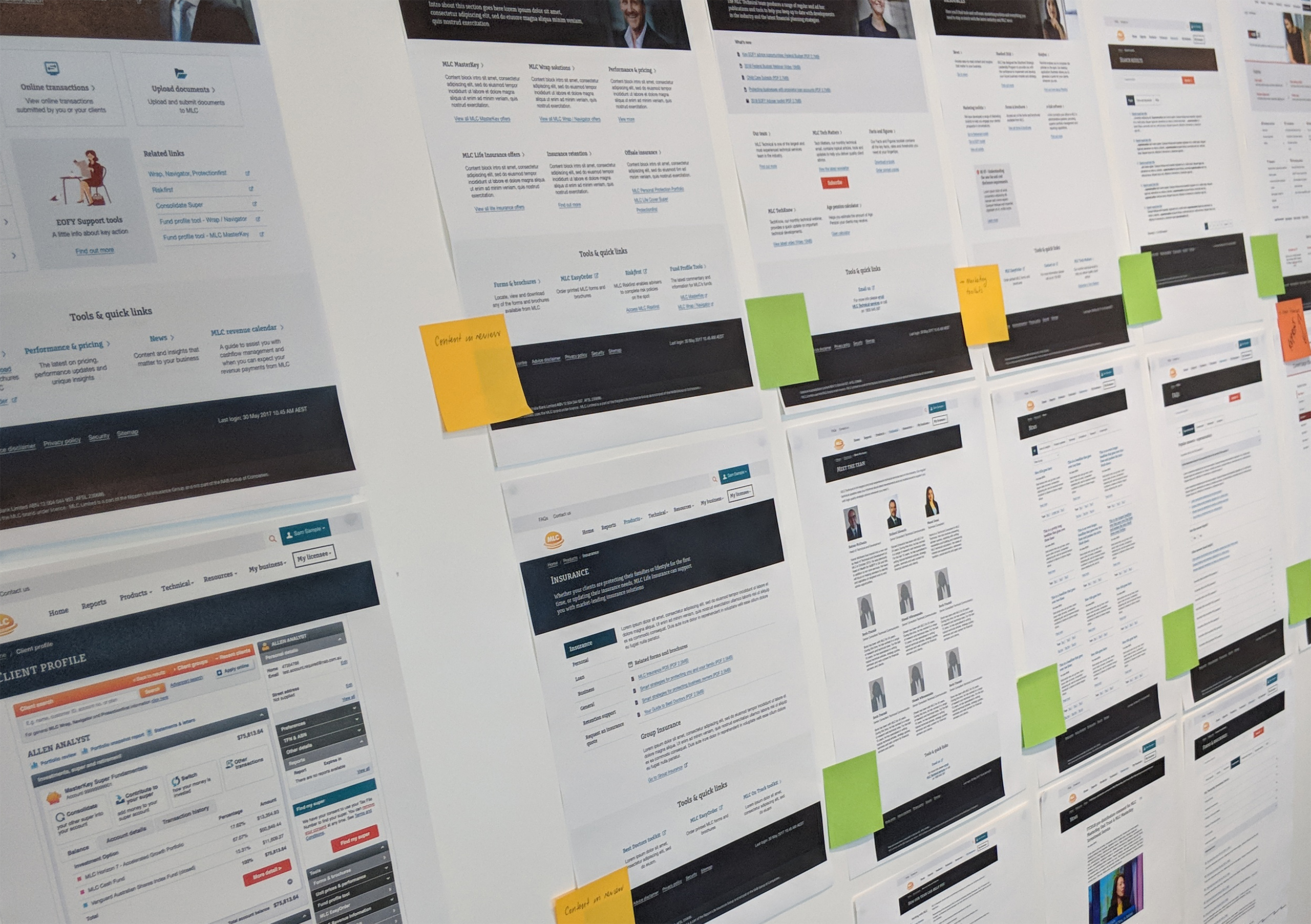
We began with an analysis of the existing structure and content. We then shared our recommendations with all relevant stakeholders. Once approved by content owners and product owner (Align), we were able to ensure the approved work could move into the next phase (Define), during which lo-fi wireframes were produced. Following various rounds of iterations driven by reviews and testing (Design), these wireframes were continuously iterated until they developed into fully flashed out UI that could be included in the acceptance criteria of each Jira story (Deliver). We would then run design-focused story grooming sessions two sprints ahead, to ensure we captured any feedback from the entire team, including dev and quality engineers.

By this stage, our designs had been through all necessary reviews, including design, accessibility, marketing, product and tech.

As a team, we worked closely and increased interactions within the scrum team and with our business stakeholders. We established early check-ins to make sure the project kept moving ahead and met our tight deadline.


Outcome

  • User interface uplift, modernising and aligning AdviserOnline with the existing MLC branding and assets,
  • clearer hierarchy of information, reduction of visual clutter to assist advisers in finding informations,
  • interface improvements to meet new accessibility standards and be accessible to more users,
  • a template approach to support faster development and maintenance,
  • enabling all text content to be editable for faster updates, minimising the risk of out-of-date content,
  • enable each licensee to maintain their branding, providing a customised template with their logo, imagery, and colour scheme.